Here’s a little project that uses Ratatui (great work btw ).
Would love to get some feedback from more experienced ratatui/rust users on the overall design / potentially missing features / things I might have done the wrong way in using the framework, etc.
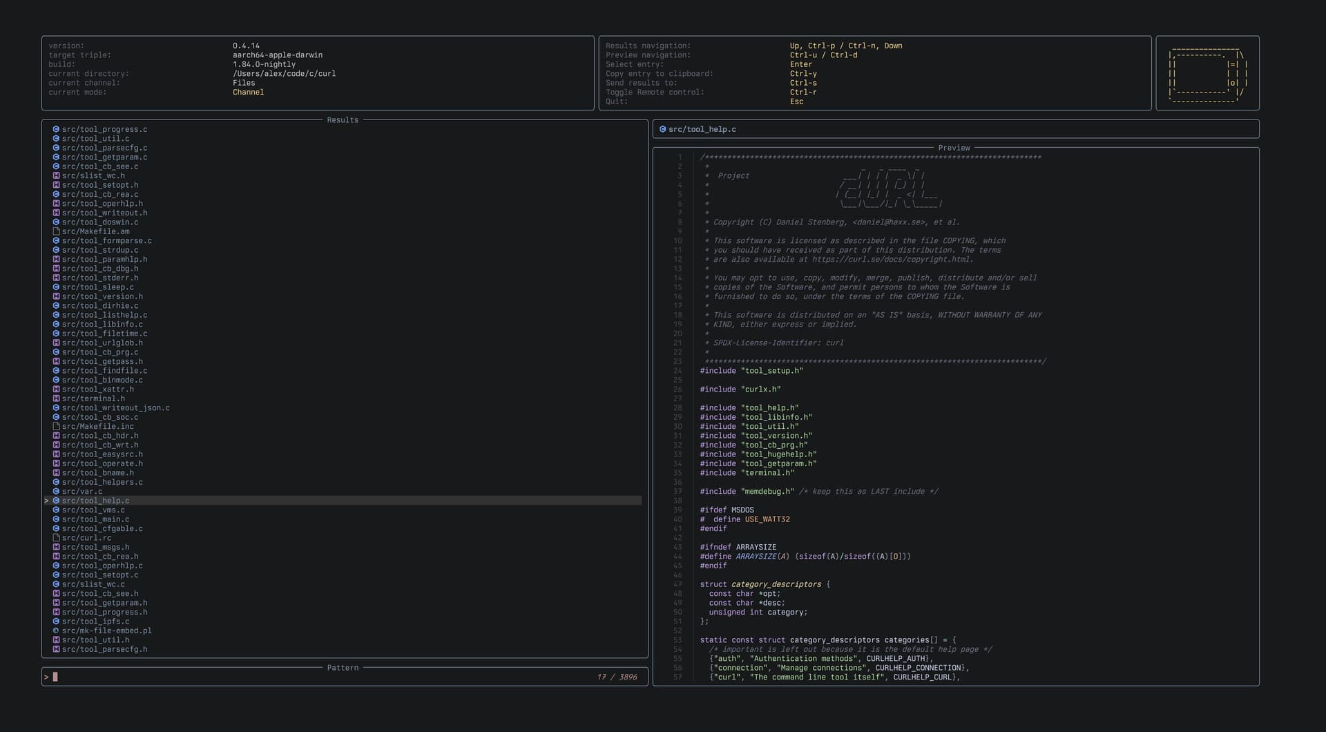
Make the screenshot smaller. 1200 pixels fits well in a bunch of places. I mostly use a laptop screen which makes picking out the details of what’s going on here difficult. There’s also a bunch of wasted empty space.
Choose a higher contrast color scheme for the screenshot even if this isn’t what you normally drive. This makes the features easier to make out.
Use PNG for screenshots instead of JPG to avoid blurry text
Think about what the information hierarchy is. Looking at this for the first time, I have no idea where I’m supposed to be be looking. where’s the focus
Consider reducing the number of boxes and lines significantly (or at the very least collapsing them.
If you do keep the boxes make them low contrast except for the highlighted pane, which should be brighter / colored / thicker
Repo notes:
Tell me what this does and the benefit in the first paragraph. It’s a fuzzy finder is all you tell me. If I’ve never used one, help the user work out why they’re reading.
Source notes:
Any of my criticisms of the code would be really be criticisms of the template used, which is on my list of things to do at some point. Mainly the template has quite a few areas where the choices lead to a high default complexity. Is this how you felt when implementing using it, or did you find it simple to use?
Thanks for taking the time to write that feedback, greatly appreciated.
I did clear up the documentation and tried to make it more obvious what you’re looking at.
Also put a little work in simplifying the UI and made other panels opt-ins rather than having them sit there by default which I feel does help a lot.
Mainly the template has quite a few areas where the choices lead to a high default complexity. Is this how you felt when implementing using it, or did you find it simple to use?
While I do agree the template choices lead to a high default complexity, I felt like these choices made perfect sense for the application I was building and eventually managed to wrap my head around them. Also I found the ratatui website and its tutorial-like templates section to be quite well written which helped a lot. Congrats for that.
The new screenshot looks much better (colors layout etc.), but it’s still too large IMO. If you want the details of you TUI to stand out in a GitHub readme, that 1200 width limitation I mentioned is pretty critical to observe. It often results in the text in the image being a similar size to the text in the repo.
This will often mean having to design your app’s screenshot for a lower screen resolution than you might use day to day (but that’s a good thing to consider regardless).
Also I found the ratatui website and its tutorial-like templates section to be quite well written which helped a lot. Congrats for that.